Using Typescript for themed components
With Typescript the union type allows us to have better intellisense (hints) for the components you create.
As a very simplified example:
type ButtonProps = {
  color?: "red" | "blue" | "green",
}

const Button: React.FunctionComponent<ButtonProps> = props => (
  <button style={{ backgroundColor: props.color }}>{props.children}</button>
)
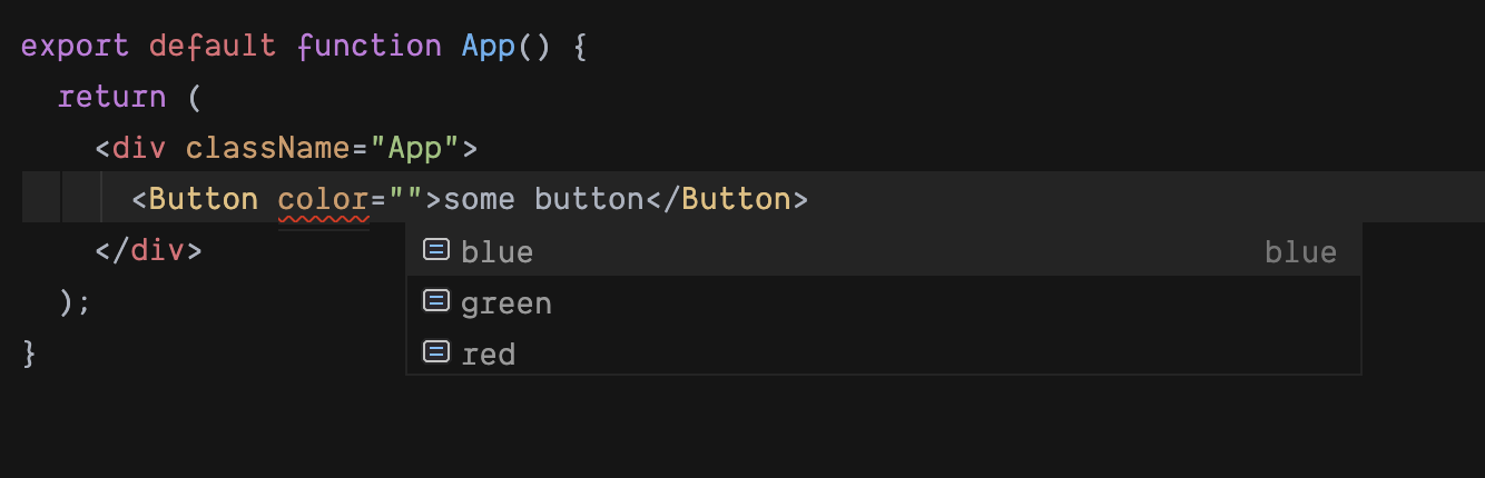 Note: the red underline goes away when you actually pick an option.

Using the | union operator will allow red, blue, or green but not say, yellow or purple.
But what happens if we're using components that have a theme, with something like styled-system (opens new window) or theme-ui (opens new window)? Or even, what if we want the string red to be something more like a role name, like PrimaryButtonBackground?
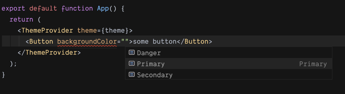
A theme is an object that maps names (strings) to values. In the case of colours, it's the hex codes:
const theme = {
  colors: {
    Primary: "#4ec9ff",
    Secondary: "#ffc139",
    Danger: "#ff8150",
  },
}
When using a styled function, like emotion:
type ButtonProps = {
  backgroundColor?: "Primary" | "Secondary" | "Danger",
}

const Button =
  styled.button <
  ButtonProps >
  `
  ${color}
`
The resulting intellisense hinting: